In the rapidly evolving landscape of data visualization and geographic information science, maps have transcended their traditional role as mere tools for navigation. Today, they serve as powerful narrative devices, designed to uncover hidden patterns, reveal spatial relationships, and make sense of highly complex, multidimensional datasets. While standard reference maps are indispensable for finding one’s way from point A to point B, another class of cartography holds the key to analytical decision-making: the thematic map.
A thematic map is a specialized instrument designed to visually represent data tied to a specific theme, subject, or phenomenon within a defined geographic area. Whether illustrating population density shifts, tracking the path of a disease outbreak, or analyzing regional economic disparities, thematic maps focus heavily on spatial patterns and trends. By utilizing colors, symbols, shading, and structural distortions, these maps transform raw, abstract numbers into clear visual narratives that are immediately accessible to researchers, policymakers, and the general public.
Understanding the Core: What Is a Thematic Map?
At its fundamental level, a thematic map is engineered to answer specific questions about the distribution of a single attribute or a small group of related attributes. Unlike general reference maps—such as topographic maps, road maps, or city street guides that emphasize physical and administrative features like highways, rivers, and boundaries—thematic maps prioritize the conceptual data overlay.
On a thematic map, the geographic background, or "base map," is simplified. This simplification ensures that the viewer’s attention is directed entirely toward the thematic data being presented. For example, a map displaying the average annual rainfall across a continent does not need to show local county roads or minor rail networks; doing so would only clutter the visual field. Instead, it uses varying shades of blue and green to draw the eye directly to regions of high and low precipitation. By emphasizing spatial distribution over physical landmarks, thematic maps allow geographers and data analysts to isolate variables and observe how they behave across geographical space.
The Strategic Purpose and Importance of Spatial Visualization
The primary objective of any thematic map is to communicate complex spatial data quickly, accurately, and effectively. In an age characterized by information overload, raw spreadsheets and static databases can obscure critical trends. Thematic mapping solves this problem by rendering geographic patterns visible to the naked eye.
The importance of this visual simplification cannot be overstated. In environmental science, for instance, a thematic map can illustrate how rising global temperatures correlate with changing agricultural yields, highlighting vulnerable zones that require immediate intervention. In urban planning, municipal authorities rely on these maps to assess how population growth patterns align with existing public transit networks, helping them allocate resources more efficiently.
Ultimately, thematic maps democratize information. They translate highly technical research and massive datasets into intuitive visual stories that can be easily digested by students, business executives, voters, and government officials alike. By providing spatial context to abstract numbers, they turn raw data into actionable intelligence.
The Five Primary Types of Thematic Maps
Depending on the nature of the data and the specific story a cartographer wishes to tell, different mapping techniques are deployed. Five primary types of thematic maps dominate the field of spatial analysis:
1. Choropleth Maps
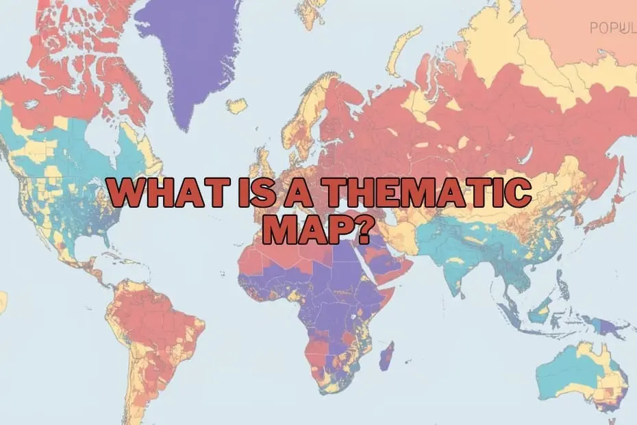
Choropleth maps are among the most common and recognizable thematic maps in use today. These maps use predefined administrative areas—such as countries, states, counties, or postal codes—and apply different shades of a color or distinct patterns to represent varying values. For instance, an electoral map showing voting outcomes by county or a map illustrating per capita income across different states typically utilizes the choropleth method. The intensity of the color generally corresponds to the intensity of the data, making it incredibly easy to identify regional clusters and disparities.
2. Isoline (Isarithmic) Maps
Isoline maps are designed to represent continuous surfaces of data that transition smoothly across space without abrupt administrative boundaries. They feature continuous lines that connect points of equal value. The most familiar examples are topographic maps showing elevation (contour lines) and meteorological maps showing atmospheric pressure (isobars) or temperature (isotherms). Isoline maps are highly effective for visualizing natural phenomena where values change gradually rather than stopping at political borders.
3. Dot Density Maps
Dot density maps use identical small dots to represent a specific quantity of a given phenomenon. Each dot corresponds to a set value—for example, one dot might represent 1,000 people, 500 acres of wheat, or 10 cases of a disease. The visual density of the dots across the map immediately conveys where a variable is highly concentrated and where it is sparse. This method is highly intuitive because it avoids the artificial uniformity that choropleth maps sometimes impose on large geographic administrative units.
4. Proportional and Graduated Symbol Maps
Unlike dot density maps, which scatter multiple identical dots across an area, proportional symbol maps place a single symbol—most commonly a circle—at a specific geographic point. The size of the symbol is scaled in direct proportion to the value of the data at that location. This technique is ideal for displaying data tied to precise coordinates or point locations, such as the total volume of cargo handled at individual shipping ports, the population of major cities, or the magnitude of earthquakes.
5. Cartograms
Cartograms are unique because they intentionally distort geographic space to reflect data values. In a cartogram, the actual land area of a country or state is resized based on the value of the variable being mapped. For example, a population cartogram of the world would show India and China as massive, dominant landmasses, while geographically large but sparsely populated nations like Canada and Australia would shrink to thin slivers. Cartograms are highly engaging visual tools that challenge our geographic preconceptions to make a powerful statistical point.
Anatomy of an Effective Thematic Map
To ensure a thematic map is both accurate and easy to interpret, cartographers must carefully balance several fundamental design elements:
- The A clear, concise title is vital. It must immediately inform the viewer of what variable is being mapped, where the data is located, and the time period the data represents.
- The Legend: Often referred to as the key, the legend is the translator of the map. It defines what the colors, symbols, shading, or line thicknesses mean, allowing the viewer to decode the visual patterns back into numerical values.
- Data Classification: Cartographers must decide how to group data into ranges or classes. Choosing between classification methods—such as equal intervals, natural breaks, or quantiles—can dramatically alter the visual narrative of the map.
- The Base Map: The background geographic layer must be simplified to avoid distracting from the main theme, yet detailed enough to provide necessary spatial context.
- Map Projection and Scale: Because the Earth is a three-dimensional sphere and maps are flat two-dimensional surfaces, choosing the correct map projection is essential to avoid distorting the relative sizes, shapes, or distances of the mapped areas.
Real-World Applications Across Industries
Thematic maps are utilized across a vast spectrum of professional fields, demonstrating their versatility as analytical and communication tools:
- Public Health and Epidemiology: Health officials use thematic maps to track the spread of infectious diseases, identify clusters of chronic illnesses, and map out access to healthcare facilities relative to vulnerable populations.
- Environmental Science and Conservation: Researchers map deforestation rates, wildlife migration patterns, pollution levels, and the impacts of climate change on specific ecosystems to guide conservation policy.
- Urban Planning and Public Infrastructure: City planners map demographic shifts, traffic congestion patterns, and utility usage to design better public transport systems, zone residential areas, and plan future infrastructure projects.
- Business Intelligence and Marketing: Corporations leverage thematic mapping to analyze consumer demographics, identify optimal locations for new retail branches, and visualize market share distribution across different regions.
Balancing Strengths and Limitations
While thematic maps are incredibly powerful, they are not without their limitations. Understanding both their advantages and drawbacks is critical for anyone interpreting or creating them.
Advantages
The primary benefit of thematic maps is their unparalleled ability to simplify complex spatial datasets. They allow users to quickly identify geographical trends, outliers, and correlations that would remain hidden in standard text or spreadsheet formats. Furthermore, because they rely on universal visual cues like color and size, they are highly engaging and easily understood by non-expert audiences, making them excellent tools for public advocacy, journalism, and education.
Limitations
On the other hand, thematic maps can easily mislead viewers if designed poorly or interpreted incorrectly. One major limitation is data generalization; by grouping data into broad categories or administrative boundaries, local variations can be completely obscured. This can lead to the "ecological fallacy," where an observer assumes that the average characteristics of an entire area apply to every individual living within it.
Additionally, the choice of boundary lines can distort reality. For example, a choropleth map of population density by state might suggest that population distribution changes abruptly at state lines, when in reality, human settlement patterns flow continuously across political borders.
The Modern Cartographer’s Toolset
In the past, creating thematic maps was a painstaking, manual process reserved for professional cartographers. Today, a robust ecosystem of digital tools and software has democratized map-making, allowing anyone with a computer to generate high-quality spatial visualizations.
- Geographic Information Systems (GIS): Industry-standard software packages like Esri ArcGIS and the open-source alternative QGIS offer unparalleled control over data analysis, spatial modeling, and map design. These platforms are favored by geographers, urban planners, and scientific researchers.
- Business Intelligence and Data Visualization Software: Tools like Tableau and Microsoft Power BI have integrated powerful mapping capabilities directly into their business analytics suites, allowing users to convert corporate data into interactive thematic maps with minimal technical training.
- Web-Based Mapping Platforms: Cloud-based platforms make it easier than ever to design, publish, and share interactive maps online, making spatial data highly accessible to web developers and digital journalists.
Frequently Asked Questions
What is the difference between a thematic map and a reference map?
A reference map focuses on showing the locations of geographic features, such as roads, rivers, cities, and political boundaries, primarily to help users navigate. A thematic map, by contrast, focuses on a specific subject or theme, using spatial data to show patterns, trends, and distributions of a particular variable.
Can thematic maps be used to visualize historical data?
Yes, thematic maps are highly effective for historical analysis. They are frequently used to visualize historical trends over time, such as changes in population density, the shifting boundaries of empires, the spread of historical pandemics, or industrialization patterns during the 19th century.
What software is best for beginners to create thematic maps?
For those new to spatial data, QGIS is an excellent, free, open-source desktop GIS program with a wealth of online tutorials. For business professionals who want to quickly visualize data without learning complex GIS software, Tableau offers highly intuitive drag-and-drop mapping tools.
How do I choose the right type of thematic map for my data?
The choice depends entirely on the nature of your data. If you are mapping data aggregated by administrative boundaries (like average income by country), a choropleth map is ideal. If your data is continuous and transitions smoothly across space (like temperature or elevation), use an isoline map. For showing discrete point data with varying magnitudes, proportional symbol maps are the most appropriate choice.
Are thematic maps only used in geography?
No. While they originated within the discipline of geography, thematic maps are widely utilized across a vast range of fields today, including public health, economics, environmental policy, corporate marketing, urban planning, sociology, and political science.