The debate over whether design is an innate talent or a learned skill often begins with a familiar admission: “I don’t have a design eye.”
For Kaitlin, the education and outreach specialist at storytelling with data, this sentiment was stated matter-of-factly—as simply a fact about herself, much like her height or her hometown. Passionate, creative, and deeply committed to her work—particularly when it comes to raising awareness of the organization’s children’s book, Daphne Draws Data—Kaitlin was, by her own admission, not a designer.
Yet, working through projects together has yielded observable progress. Observers have noted a more intentional use of color, cleaner font choices, and a growing awareness of how the materials she creates will actually be used in practice. This steady evolution brings up a foundational question for professionals across industries: Can design actually be taught?

The answer, according to experienced visual communicators, is an unequivocal yes, though with a distinct caveat. People come to design with varying natural starting points. Some individuals possess an innate sensitivity to visual harmony—they instinctively notice when something is visually “off” before they can fully articulate why. Others must work harder to develop that same instinct.
However, experience shows that everyone can improve. The gap between where an individual starts and where they can ultimately get is largely a function of attention, practice, and knowing what specific elements to look for. This mirrors core philosophies surrounding the design of effective graphs and data visualizations. Designing clear visual communication is not a rare talent that someone either has or does not have; it is a fundamental skill that can be systematically cultivated over time.
For those who have ever dismissed their creative capabilities by declaring they are “just not a design person,” or for professionals attempting to mentor others toward visual competence, experts suggest examining ten core principles that govern effective design.
Start with Your Audience, Not Your Content
The primary question to ask before opening any software tool or touching a layout is deceptively simple: Who will see this, and what do they actually need from it?
While it sounds obvious, professionals remark on how frequently this step is bypassed. Creators often start with what is readily available—the raw content, an existing template, or a layout repurposed from a previous project—and work forward from there. The inevitable result is a design that primarily serves the creator rather than the audience.
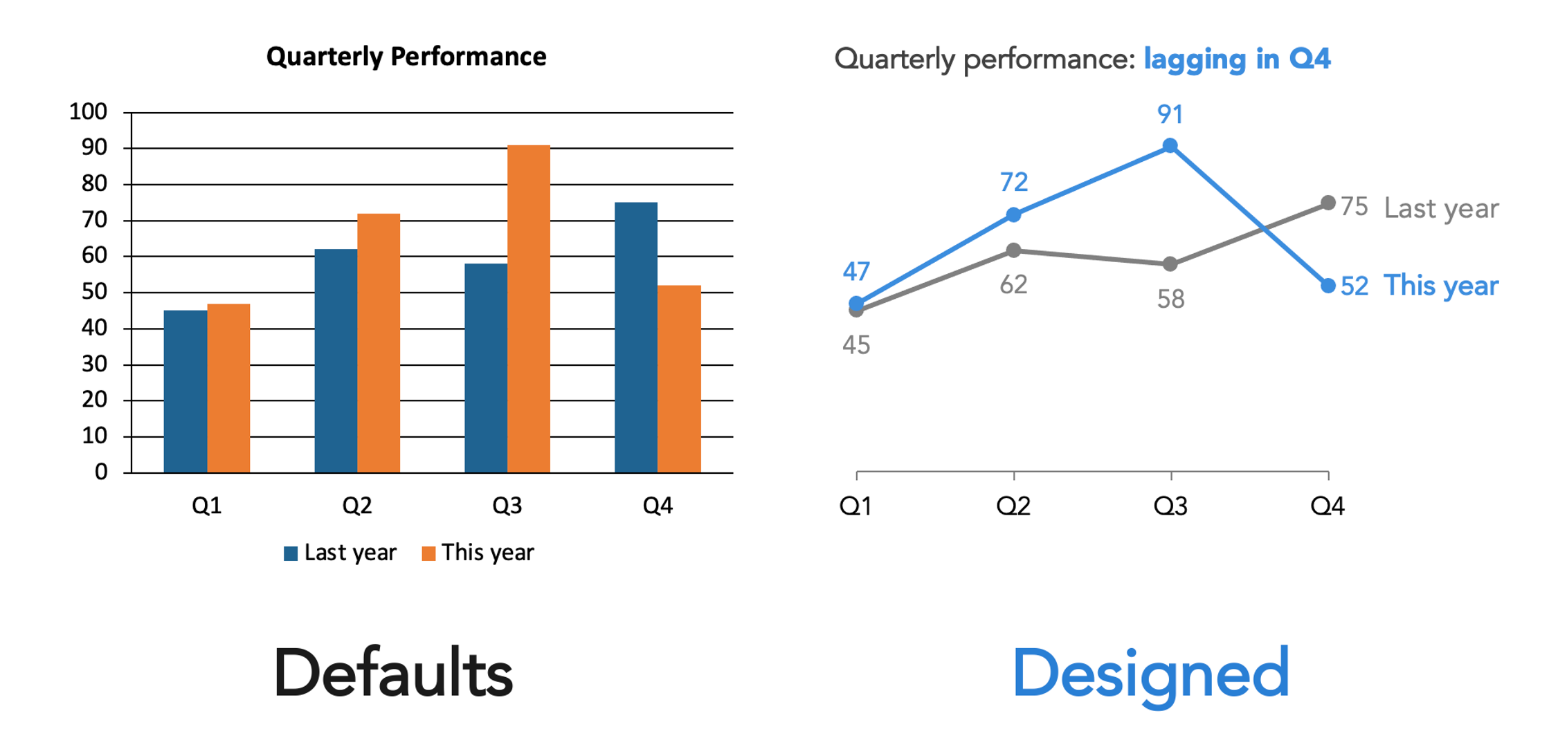
Don’t Let the Default Be Your Design
Every modern software tool—whether it is presentation software, a graphic design platform, a web builder, or a word processor—makes design choices on behalf of the user. Default fonts, automatic color palettes, and pre-set layouts are embedded into these systems.
These defaults are rarely neutral. They represent someone else’s decisions, tailored for a generic use case that likely does not align with a specific project’s goals. Accepting defaults uncritically is equivalent to making an unconsidered choice. The first step toward better design is simply recognizing that these automated choices exist and questioning whether they truly serve the material.
Constrain Your Choices
A common misconception is that having more options equates to creative freedom. In design, an abundance of choices usually introduces visual noise. When every font, color, and layout is readily available, the result is frequently a visual cacophony where competing elements prevent anything from standing out.
Constraints help eliminate this noise. Utilizing a limited color palette, sticking to a single typeface, or committing to a specific layout brings order to a project. Organizations with established brand guidelines or templates provide a head start by doing much of this foundational work, ensuring consistency that builds recognition and trust. The goal is coherence rather than restriction, allowing real design decisions to emerge clearly within those boundaries.
Create Clear Visual Hierarchy
A viewer’s eye will naturally move through a design regardless of whether the creator directs it. The central question is whether the eye moves in the intended sequence. Visual hierarchy is the deliberate mechanism used to control that flow.
Determining what viewers should notice first requires making the most critical element visually prominent. Establishing a clear sequence for secondary and tertiary information ensures the message is digested logically. This does not require elaborate techniques; size, weight, position, and spacing can establish hierarchy simply and effectively. It simply requires forethought before placing elements on a page.
Understand That Differences Signal Meaning
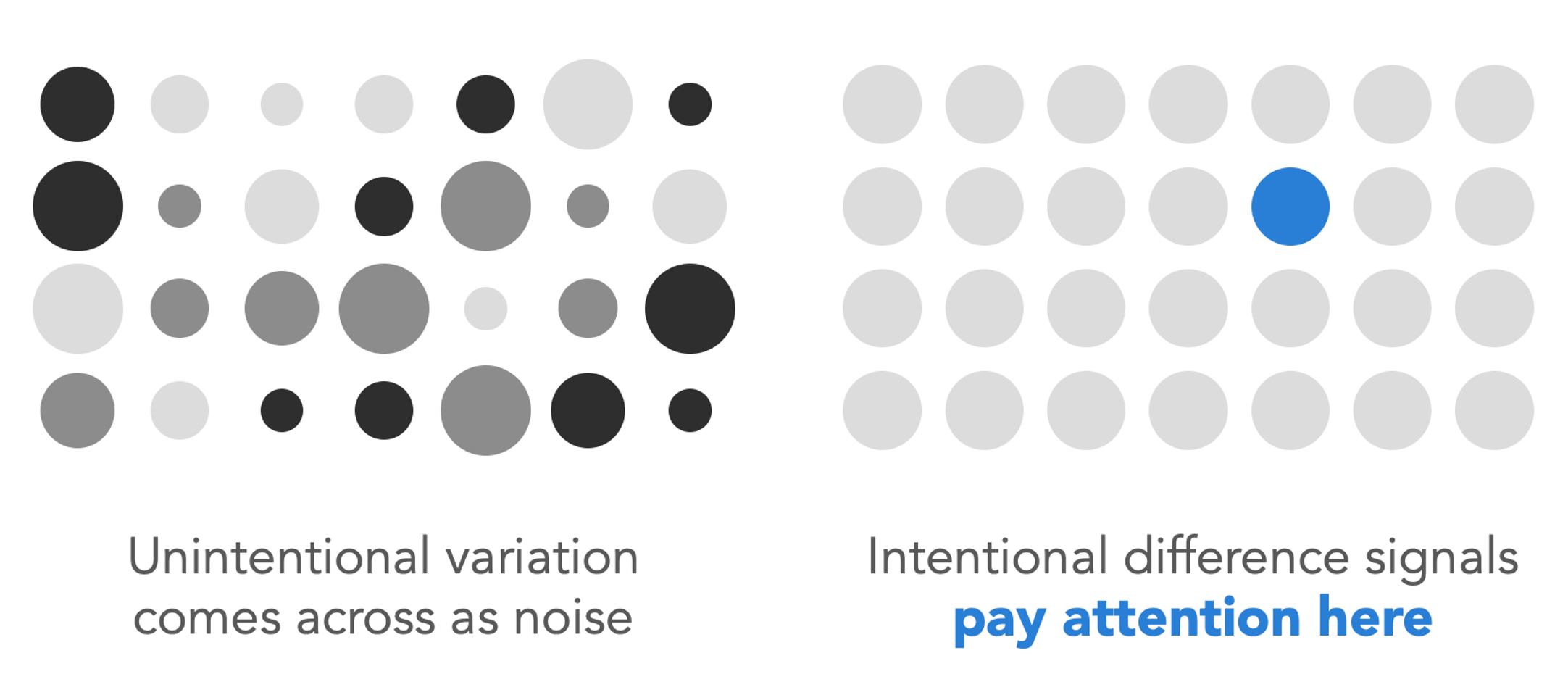
One of the most vital design principles—and one of the most frequently violated—revolves around how variation is interpreted by the human eye. When an element within a design is different—whether it is rendered larger, bolder, in a distinct color, or with a different font—viewers interpret that variation as meaningful. It signals that this specific point requires attention because it matters more.

The corollary is that unintentional variation creates confusion. If multiple elements feature slightly different sizes without a clear purpose, the viewer will still attempt to interpret the discrepancy, searching for missing context. Inconsistency reads as distracting noise, whereas intentional variation reads as a clear signal. Every difference in a design should carry distinct meaning, and elements that share a category should look identical.
Use Color with Purpose
Color remains one of the most powerful tools in visual communication, yet it is frequently misused. The appropriate application of color depends entirely on the communication goal.
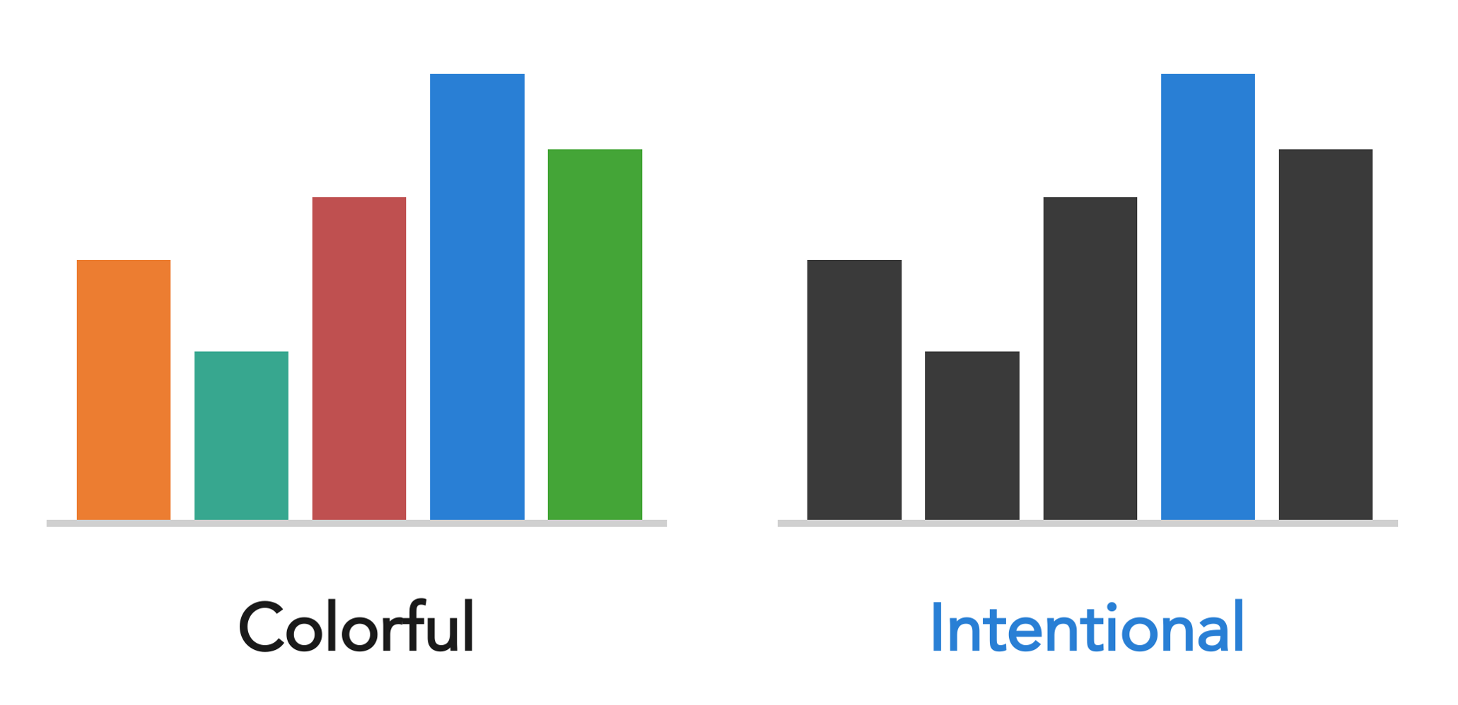
When creating expressive works—such as illustrations, posters, or children’s book covers like Daphne Draws Data—color can be rich, playful, and abundant to match the creative spirit and engage young audiences. However, a completely different logic applies when directing attention within a data graph or a presentation slide. A mostly neutral palette accompanied by a single, intentional color used sparingly is vastly more effective than a multitude of competing hues. The guiding question should never be simply which colors the creator likes, but rather what function the color is serving within the design.
Align Everything Thoughtfully
Alignment is one of the most telling indicators distinguishing a polished project from an amateur one. Misaligned elements—such as text that is slightly off-line or objects placed near an invisible grid rather than on it—generate a subtle yet persistent visual unease for the viewer, even if they cannot immediately identify the technical flaw.
Center-aligned text, in particular, frequently floats unmoored on a page, creating jagged edges on both the left and right sides that generate visual tension. Left-aligning text anchors the content. Utilizing software alignment functions, enabling gridlines, and ensuring every element is intentionally anchored to a margin, a grid, or another object transforms the overall polish of a project.
Give Things Room to Breathe
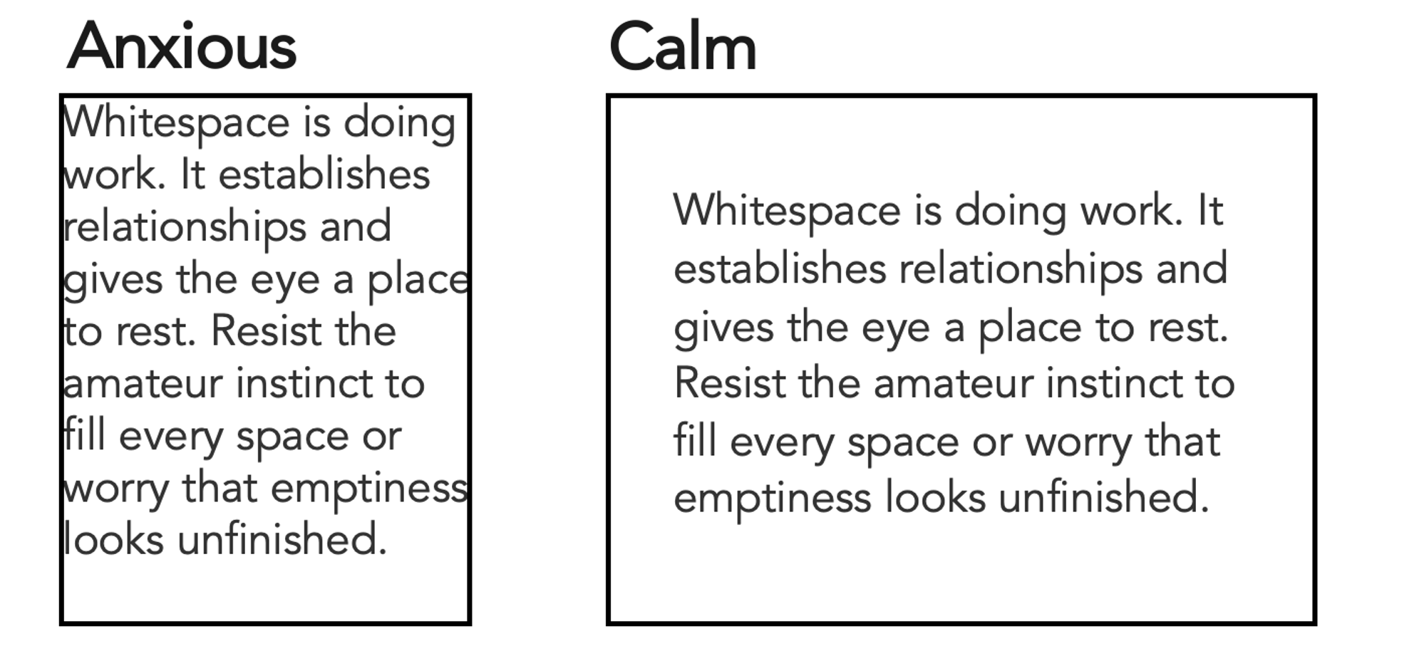
Whitespace—the deliberate empty space surrounding design elements—is never wasted space. It performs active work by creating separation, establishing relationships between ideas, and providing the eye a place to rest.
Creators new to design often feel an instinctive urge to fill every available inch, driven by the fear that empty space looks unfinished. Resisting this urge is critical. Some of the most effective visual communications are defined just as much by what is omitted as by what is included.
Seek Inspiration Actively
Visual literacy is cultivated through observation. When an effective book cover, menu, color combination, or clear data graph catches the eye, pausing to analyze why it works builds analytical habits. Examining ineffective design and identifying its flaws yields similar educational value.
Engaging actively with visual surroundings accelerates the development of a trained eye over time. Professionals looking to refine their data visualizations often explore community discovery platforms and shared libraries to browse thousands of real-world examples, observing what techniques succeed in practice.
Trust Your Eyes, Then Train Them
Design instinct is rarely absent in individuals; most people possess a baseline awareness of when something feels visually incorrect, even if they struggle to articulate the technical fix. That initial discomfort is data in itself and should be trusted.
However, instinct represents a starting point rather than a ceiling. The distinction between someone who views themselves as incapable of design and someone who executes it competently is accumulated practice, awareness, and iterative feedback. Training the visual eye functions much like developing any other skill: through consistent application, attentive observation, and a willingness to iterate.