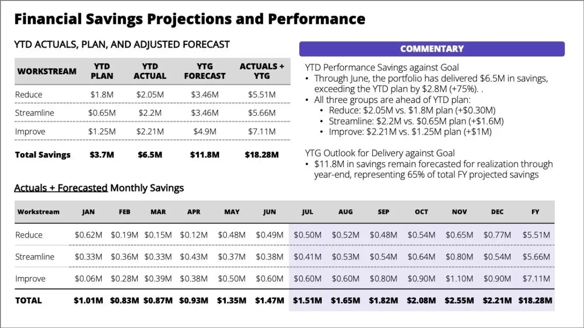
In the contemporary corporate landscape, executive communication often stands or falls on the efficacy of a single presentation slide. Business analysts and communication strategists have long wrestled with how to translate dense corporate performance data into clear, actionable insights without overwhelming stakeholders. A critical examination of standard corporate deck practices reveals that standalone commentary, while theoretically useful for context, frequently fails because the core message remains obscure. Instead of instantly grasping the trajectory of a business unit, a reader is typically forced to work diligently just to identify what matters and why.
Corporate communication experts argue that a strong pre-read document should accomplish a very specific goal: it must help leaders arrive at a meeting fully informed and ready for substantive discussion. When a document is cluttered with dense tables and sprawling commentary, it achieves the exact opposite effect. Rather than preparing executives, it leaves them frantically scanning through columns of figures right up until the moment the meeting begins. This friction-heavy approach to professional sharing shifts the burden of analysis onto the audience, eroding the primary advantage of advance preparation.
The challenges multiply exponentially when transitioning from a solitary pre-read document to a live presentation setting. In a live environment, a cluttered slide creates immediate behavioral friction among participants. The presence of busy tables and heavy blocks of bulleted text forces audience members to split their attention awkwardly between reading the dense information projected on the screen and listening to the speaker’s verbal delivery. Even when thoughtful audience members have diligently read the material in advance, they inevitably spend valuable minutes hunting for specific details during the presentation rather than engaging with the overarching message.
Communication specialists emphasize that a live delivery is far more effective when the speaker deliberately guides the audience’s attention. Rather than committing the classic error of showing everything at once—a phenomenon that invites immediate cognitive overload—effective presenters reveal information one idea at a time. This pacing allows the narrative to breathe, ensuring that every listener remains synchronized with the speaker’s core argument without getting lost in extraneous data fields.
Start with the Purpose
To overcome these perennial presentation pitfalls, communication designers stress that being hyper-specific about the situation is the fundamental key to improving visual and structural design. Creators must begin by asking critical baseline questions: What exactly does this slide need to achieve? Who will be using it, and in what specific setting? Once those parameters are firmly determined, it becomes infinitely easier to shape the narrative arc and choose the most appropriate visual format for the information at hand.
Consider a recent scenario involving a corporate client attempting to communicate year-to-date performance figures alongside future forecasts. The overarching message the client urgently needed to convey was that, although the organization’s year-to-date performance was currently ahead of plan, a substantial amount of heavy work remained to achieve the end-of-year forecast. The primary call to action for the leadership team was equally clear: the organization needed to reiterate its core priorities to ensure that everyone remained relentlessly focused on three distinct workstreams, while simultaneously establishing a rapid mechanism to quickly escalate any operational blockers that threatened to impede projected cost savings.
Articulating this fundamental goal before designing a single graphic helps determine what stays, what gets ruthlessly edited out, and how to structure the narrative for each distinct operational situation. Without this disciplined approach to purpose, presentations routinely default to data dumps, burying vital strategic warnings beneath mountains of secondary metrics.
Let’s consider the live delivery environment first, as it demands a fundamentally different approach than a static report left on a desk. When presenting in person, a speaker does not need to cram every single detail onto a single view because the human presenter, not the slide software, controls the pacing of the room. Instead of showing an intimidating wall of data all at once, the communicator can break the complex content into a logical sequence where each sequential slide supports a specific, isolated point.
Through this method of progressive disclosure, complex operational realities regarding performance metrics, remaining workload, strategic workstreams, and escalation protocols can be introduced methodically. The audience is thereby led step-by-step through the narrative landscape, arriving naturally at the intended conclusions without the cognitive fatigue that has long plagued corporate boardrooms and strategy sessions.