Yesterday, during a professional workshop involving a cohort of researchers, data scientists, and statisticians, a thought-provoking question was raised that has since sparked broader discussions across the analytics community. A participant, who routinely collaborates with rigorous quantitative analysts, highlighted a fundamental tension in modern research communication: the very idea of telling a story with data can make quantitative purists deeply uncomfortable.
The core objection is rooted in a fundamental philosophical concern about scientific integrity. Doesn’t telling a story inherently mean choosing a specific perspective? And doesn’t choosing a perspective inevitably introduce bias into what should be a neutral, value-free presentation of facts? From this viewpoint, the most objective approach would appear to be simply showing the raw data, displaying the charts, and letting individual members of the audience draw their own conclusions without outside influence.
It is an instinct that is easy to understand, particularly in scientific, academic, and highly technical fields where neutrality is prized above all else. Furthermore, the very word "story" often complicates the matter. To many analysts, storytelling sounds suspiciously like an invitation to embellish facts, manufacture artificial drama, or cherry-pick isolated pieces of evidence to support a predetermined, perhaps self-serving conclusion. That, however, is a fundamental misunderstanding of what effective data communication actually entails.
At the same time, dismissing storytelling with the blanket declaration that "story doesn’t work for me" has increasingly become a convenient intellectual excuse. It allows professionals to focus entirely on the myriad reasons why narrative techniques cannot possibly function in their specific, highly specialized environment, rather than engaging in the harder, more creative work of figuring out how it actually could. Data storytelling is not a rigid, one-size-fits-all formula. It must remain flexible, adapting dynamically to the audience, the physical or virtual setting, the nature of the work, and the boundaries of what the underlying evidence can reasonably support. The narrative arc constructed by a rigorous academic researcher studying public health trends will inevitably look very different from the narrative built by a commercial strategist pitching a new product, and quite frankly, it should. The true professional challenge lies in defining what responsible storytelling means within your specific context, rather than dismissing the entire concept simply because one narrow template fails to fit.
Distinguishing Between Bias and Perspective
This ongoing debate brings the conversation squarely back to the perennial issue of analytical bias. To move forward constructively, analysts must carefully distinguish between true bias and a legitimate perspective.
Researchers and data practitioners should undoubtedly work diligently to minimize cognitive, methodological, and systemic biases that distort empirical research, skew statistical models, or misrepresent analytical findings. But maintaining analytical rigor is entirely different from pretending that human beings can completely eliminate perspective from the communication process.
Long before a presenter decides how to visually communicate their final findings to a board of directors, a funding agency, or the general public, they have already made a long cascade of subjective choices. What core phenomenon did they decide to study in the first place? What specific variables did they choose to measure, and by what operational definitions? Which survey questions were asked, and which ones were left off the instrument? What datasets were selected for inclusion, and which were discarded? Which specific statistical comparisons were prioritized? Even the deceptively simple decision to place one specific chart in front of an audience—while omitting the dozens of alternative visualizations that could have been generated from the exact same dataset—is an active choice.
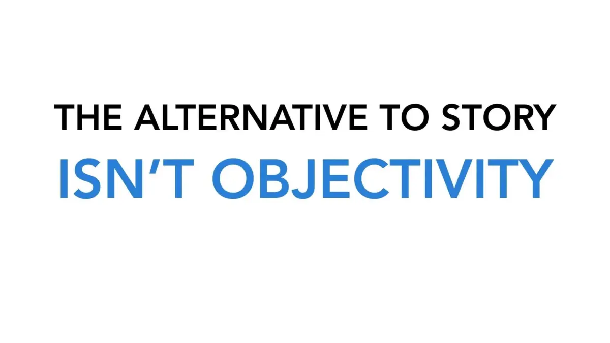
There is no magical, frictionless moment when an analyst can simply "show the data" in a pure state, completely devoid of human influence over what the viewer ultimately sees. The real alternative to crafting a structured, thoughtful narrative is not pristine objectivity; it is the illusion of it. Having a clear perspective is not a professional flaw—in fact, when managed responsibly, it is an essential public service.
You Know the Data Better Than Your Audience Does
Anyone who has spent weeks, months, or years conducting primary research or building complex statistical models knows their data intimately—far better than the audience they are eventually asked to present it to.
If you are the analyst, you have explored every nook and cranny of the dataset. You have probed it with rigorous questions, watched it yield surprising anomalies, investigated unexpected outliers, understood its inherent limitations, and absorbed the rich qualitative context that surrounds the numbers. Why, then, would an analyst choose to discard all of that hard-won contextual knowledge precisely at the moment of communication, when the audience needs that insight the most?
For years, experts in visual communication have argued that audiences should not be forced to guess what an analyst is trying to convey. More than a decade ago, industry discussions highlighted the vital importance of "leading with story": the premise that if you have done the heavy lifting of conducting an analysis, you occupy a unique, authoritative position to interpret those findings and help others grasp their true significance. Subsequent frameworks have continually reinforced the responsibility of modern communicators to make their central thesis unmistakably clear, rather than lazily leaving it to exhausted stakeholders to figure it out on their own.
That argument carries even more weight in today’s information-saturated environment. When an analyst chooses not to offer a clear perspective, they do not succeed in eliminating interpretation; they simply outsource it.
Your audience will inevitably make sense of the data somehow. They might arrive at the exact conclusion you intended, but they are equally likely to miss a critical nuance, misunderstand a complex metric, or draw an entirely erroneous inference. In worst-case scenarios, an unguided audience member or an opportunistic actor could selectively weaponize your neutral data to advance a narrative that the underlying evidence actively refutes.
"Just showing the data" provides zero systemic protection against bias, misinterpretation, or deliberate misuse. In many professional contexts, an analyst’s deliberate silence actually makes those negative outcomes significantly more likely.
If ‘Story’ Feels Uncomfortable, Start With Perspective
For professionals who still find the terminology of storytelling jarring or overly theatrical, the solution is simple: scale back the vocabulary and start with perspective.
Given the deep, granular familiarity you have with your data, what do you actually see? What patterns or trends immediately deserve the audience’s undivided attention? What conclusions can a rational stakeholder reasonably draw from these figures? What strategic decisions, policy shifts, or operational conversations should this empirical information inform?
Importantly, bringing a perspective does not require fabricating a single, absolute, dogmatic answer where none exists. This is precisely where the definition of data storytelling must remain flexible. In exploratory research settings, an analyst’s narrative might successfully surface multiple competing perspectives: outlining one plausible interpretation of the findings, presenting an alternative possibility, and explicitly laying out the unresolved questions that the data brings to the surface. This approach equips stakeholders with a highly useful intellectual starting point without falsely pretending that the data supports a level of certainty that simply does not exist.
Furthermore, bringing a clear perspective does not mean overstating what quantitative evidence can tell us. In fact, the exact opposite is true. An essential part of an analyst’s ethical responsibility is to explicitly communicate methodological uncertainty, study limitations, confounding variables, and plausible alternative explanations. The goal is never to ensure that your work has more impact than the empirical evidence warrants; however, a generalized fear of having an oversized impact is never a valid professional excuse for aiming to have zero impact at all.
Don’t Use Rigor as a Reason to Be Passive
Ultimately, this is where an unyielding discomfort with narrative structures can lead analytical professionals astray. Adopting the posture that "my professional role is simply to inform" sounds admirably objective on the surface. Yet, in practice, that passive stance can frequently serve as a convenient mechanism for avoiding the much harder intellectual labor of deciding what information actually means and helping others navigate its complexity.
An analyst can maintain absolute methodological rigor while simultaneously holding a clear point of view. It is entirely possible to tell a compelling, evidence-based story while fully acknowledging analytical uncertainty. A skilled communicator can successfully direct an audience’s attention to key insights while simultaneously providing them with the exact raw evidence they need to challenge that very interpretation. These concepts are not mutually exclusive contradictions; they are the foundational pillars of responsible, professional communication.
Therefore, when the immediate internal reaction to storytelling is that it simply "doesn’t work in my specific situation," analysts should actively resist that reflex and ask a more productive question: What could effective storytelling actually look like in my environment?
For some, it may take the shape of a bold, data-backed strategic recommendation. For others, it may be a clearly articulated empirical finding. It might involve presenting several competing interpretations alongside the weight of evidence supporting each one, or it could be as straightforward as directing an audience toward the metrics that genuinely deserve their focus and explaining the underlying context behind them.
By flexing the concept to fit the specific professional reality, analysts can bring their hard-earned knowledge, contextual awareness, and reasoned perspective directly to the data. From there, they can provide their audience with everything required to question, challenge, build upon, or act decisively on the findings. Refusing to tell a story does not eliminate perspective; it merely surrenders the narrative to someone else.