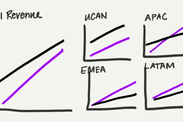
"I don’t have a design eye."
Kaitlin says this matter-of-factly, as if it is simply an immutable fact about herself, much like her height or her hometown. As the education and outreach specialist at storytelling with data, Kaitlin is passionate, creative, and deeply committed to her work, particularly when it comes to raising awareness for the organization’s children’s book, Daphne Draws Data. Yet she is also, by her own admission, not a designer.
This self-assessment is a common refrain across many professions. People frequently partition themselves into two camps: those who possess an innate creative talent and those who do not. But working closely with team members on visual communication projects reveals a different reality. Progress is visible over time—a more intentional use of color here, a cleaner font choice there, and a growing awareness of how the things people create will actually be used by an audience.

That trajectory prompts a fundamental question about professional development and creative capability: can design truly be taught?
The answer is an unequivocal yes, though it comes with a nuanced caveat. Individuals certainly come to design with different natural starting points. Some harbor an innate sensitivity to visual harmony, noticing instinctively when something is off even before they can articulate the underlying cause. Others must work harder to develop that specific instinct. However, experience and observation demonstrate that everyone can improve. The gap between where a person starts and where they can ultimately arrive is largely a function of attention, deliberate practice, and knowing what specific elements to look for.
This mirrors core principles regarding the creation of effective graphs and data visualizations. Designing clear visuals is not a mystical talent that someone either has or lacks from birth; it is a learned skill. Like any other professional competency, it can be cultivated through practice and reflection. For anyone who has ever dismissed their capabilities by declaring themselves "just not a design person"—and for those tasked with helping colleagues bridge that gap—there are fundamental concepts worth learning and integrating into daily work.
Start with Your Audience, Not Your Content
The foundational step in any visual communication task occurs before opening any software tool or touching a layout: identifying who will see the material and what those individuals actually need from it.
While this sounds intuitively obvious, creators remarkable often skip this step entirely. Instead, they start with what they already have on hand—the raw content, an existing presentation template, or a layout salvaged from a previous project—and work forward from there. The resulting design inevitably serves the creator rather than the audience. True effective communication begins with understanding the consumer’s perspective and tailoring every subsequent visual decision to meet their informational requirements.
Look Beyond the Default
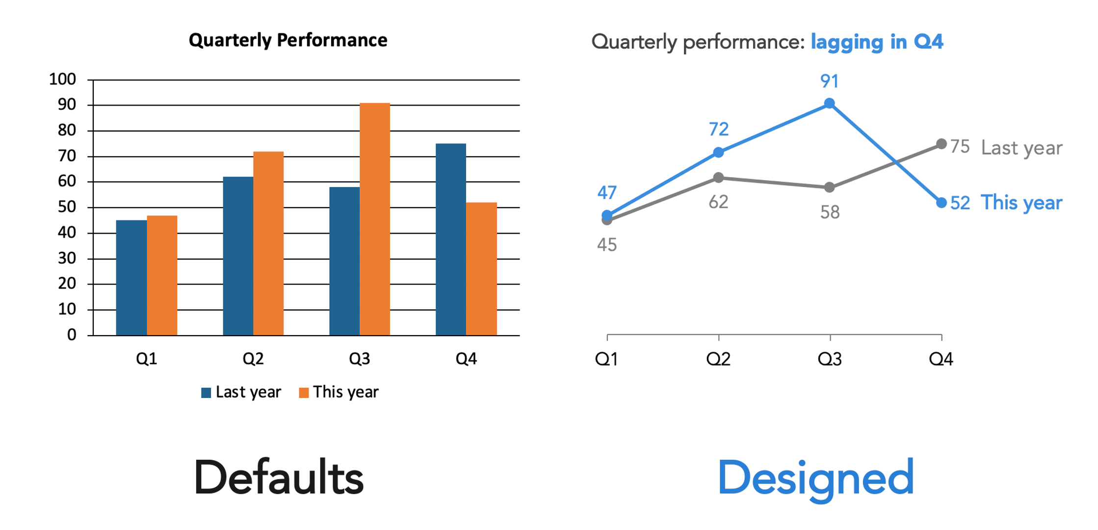
Every modern productivity and publishing tool—whether PowerPoint, Canva, Google Slides, or a website content platform—makes dozens of design choices on behalf of the user. Default fonts, automatic color schemes, and pre-packaged layouts are embedded deeply into the software. Crucially, these defaults are never truly neutral. They represent someone else’s decisions, engineered for a generic use case that almost certainly does not match the specific needs of the project at hand.
Accepting these defaults uncritically is equivalent to making an unconsidered choice. The initial step toward better design is simply developing the awareness that these automated choices exist and actively questioning whether they serve the communication goal.
Constrain Your Choices
A common misconception is that having more options equals greater creative freedom. In practice, an abundance of choices usually creates visual noise. When every font, color, and layout style is readily available, the result is frequently a cacophony where competing elements fight for attention and nothing stands out clearly.
Constraints provide necessary boundaries. Implementing a limited color palette, committing to a single typeface family, or adhering to a strict layout structure brings order to a project. When an organization utilizes existing brand guidelines or established templates, leaning into those frameworks harnesses decisions that have already been resolved. This ensures consistency across materials, which in turn builds audience recognition and trust. The goal is not creative restriction, but rather coherence. Within clear constraints, meaningful design decisions become much more apparent.
Create Clear Visual Hierarchy
Any viewer’s eye will naturally move through a design whether the creator directs it or not. The critical question is whether that movement occurs the way the author intended. Visual hierarchy is the deliberate mechanism used to answer that question.
Establishing hierarchy requires answering fundamental structural questions. What should the audience notice first? What is the most crucial piece of information? That element should be made the most visually prominent. What comes second or third? Designing this precise sequence does not require elaborate technical mastery; simple manipulations of size, weight, position, and spacing can establish hierarchy effectively. Achieving this requires thinking through the structure before placing elements, rather than trying to fix the flow afterward.
Understand That Differences Signal Meaning
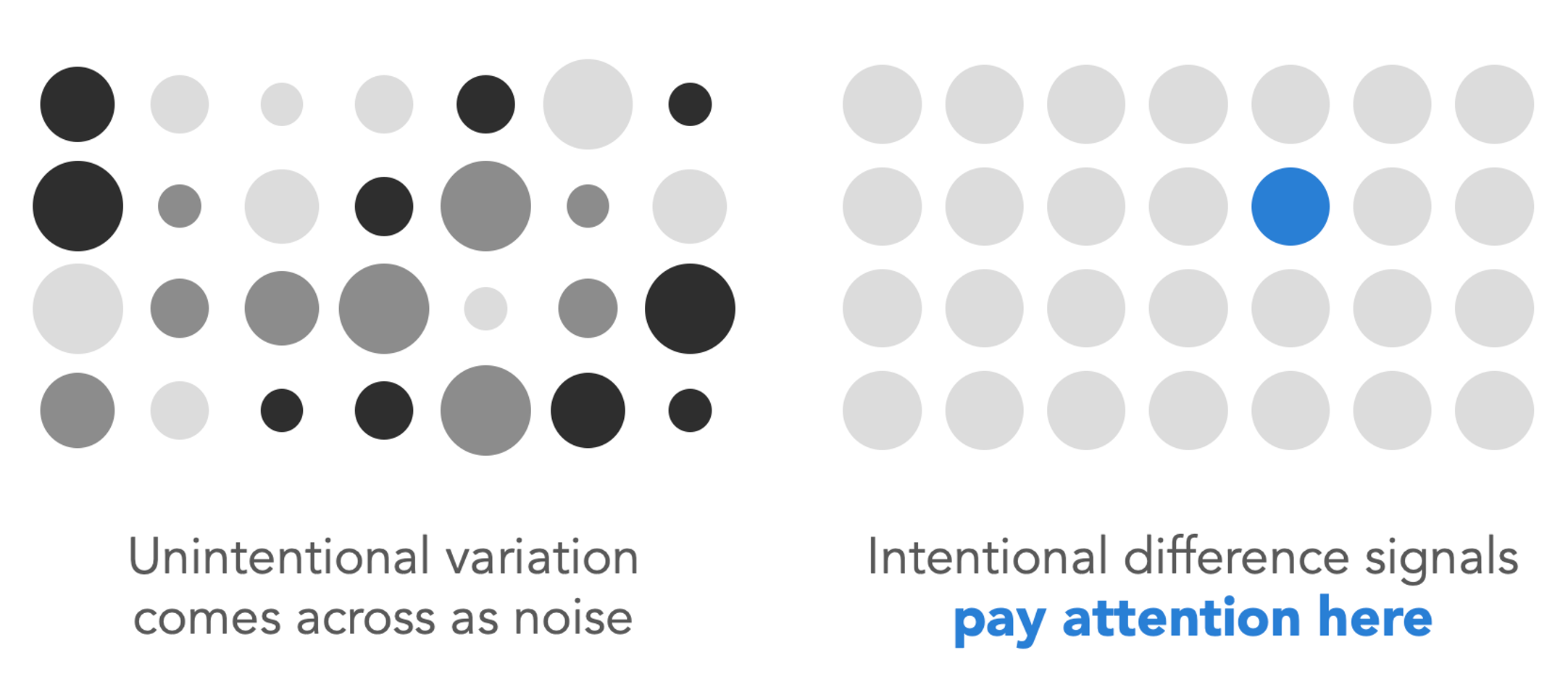
One of the most vital principles in visual design—and one most frequently violated—revolves around how humans interpret variation. When an element within a design is visibly different—larger, bolder, rendered in a contrasting color, or set in a distinct font—viewers interpret that difference as inherently meaningful. It sends a clear psychological signal: pay attention here, because this matters more.

The logical corollary is that unintentional variation creates unnecessary confusion. If multiple elements feature slightly different sizes or formatting styles without any underlying rationale, the viewer will still attempt to interpret the discrepancy, wondering what crucial detail they are missing. Inconsistency reads as distracting noise, whereas intentional variation reads as a clear signal. Before finalizing any visual material, creators must ask whether every difference actually signifies something important, and whether elements that share the same importance also share the same visual treatment.
Use Color with Purpose
Color remains one of the most powerful tools in a communicator’s arsenal, yet it is frequently misused. The appropriate approach depends entirely on the communicative objective.
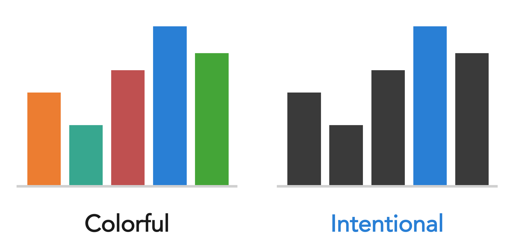
When creating expressive materials such as illustrations, posters, or book covers, color can be rich, playful, and abundant. In projects like Daphne Draws Data, color is employed exuberantly to match the lively spirit of the work and engage young readers. However, when the objective is to direct analytical attention within a data graph or a corporate presentation slide, an entirely different logic applies. A predominantly neutral palette accented by a single, intentional color used sparingly is vastly more effective than a rainbow of competing hues. The guiding question should never be "what colors do I personally like?" but rather "what is color actively doing in this design, and is it accomplishing that goal effectively?"
Align Everything Thoughtfully
Among the subtle details that separate a polished professional product from an amateurish draft, precise alignment is one of the most telling. Misaligned elements—text that does not quite square up, or objects that sit close to a grid line without snapping to it—generate a subtle, persistent visual unease for the observer. While viewers may not always possess the technical vocabulary to articulate what is wrong, they feel the discord immediately.
A notable culprit in presentations and documents is center-aligned text. When text is centered, it anchors to nothing, leaving it floating unmoored on the page. Multiline center-aligned text produces two jagged edges—one on the left and one on the right—which fosters unnecessary visual tension rather than resolving it. Left-aligning text provides a solid vertical anchor and calms the layout.
The remedy for alignment issues is straightforward: utilize software alignment functions, enable gridlines, and remain deliberate. Every visual element should align cleanly with another element, a margin, or a structured grid. Approximating placement by eye is rarely sufficient. Once an individual trains their eye to spot poor alignment, the flaw becomes glaringly obvious, making it much easier to correct.
Give Things Room to Breathe
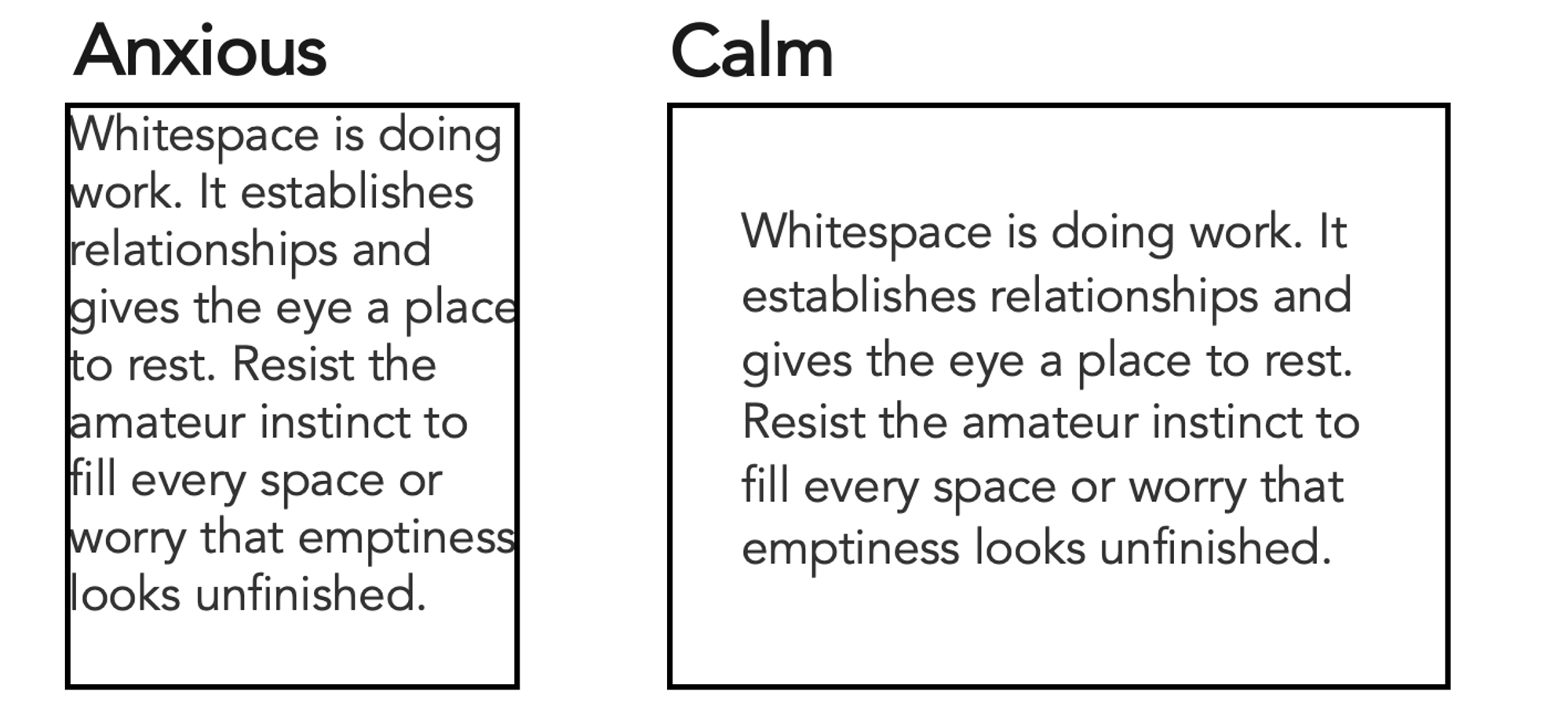
Whitespace—the deliberate empty space surrounding elements in a design—is never wasted space. It performs vital communicative work by creating separation, establishing logical relationships, and giving the viewer’s eye a place to rest. Designs that crowd elements together tend to feel anxious, cluttered, and difficult to parse, while designs featuring generous spacing convey a sense of calm, clarity, and careful consideration.
Creators new to design often experience an impulse to fill every available inch of whitespace, driven by an ungrounded worry that empty areas look unfinished. Resisting this instinct is crucial. Some of the most effective visual communications are defined just as much by what is intentionally left out as by what is included.
Seek Inspiration Actively
Design literacy is fundamentally built through observation. When a well-designed book cover, a clear restaurant menu, an appealing color combination, or an exceptionally clear data graph catches the eye, pausing to analyze why it works can accelerate learning. Asking what specific techniques are being employed helps build a mental library of effective patterns that can be applied to future work.
The same analytical approach applies to encountering ineffective design. Asking why a particular visual fails and determining what changes would improve it turns everyday observation into an active habit. This analytical looking compounds over time, rapidly sharpening visual instincts. Inspiration is omnipresent; noticing it simply requires a shift in attention. For those wishing to practice data visualization specifically, curated online spaces—such as the discover page hosted by the storytelling with data community, which features thousands of visuals created by practitioners—offer extensive material for exploration and critique.
Trust Your Eyes, Then Train Them
Ultimately, most people possess considerably more design instinct than they realize. When something feels visually "off," even if the exact reason cannot immediately be articulated, that feeling constitutes valid data. Trusting that initial reaction serves as a vital starting point.
Yet instinct is merely a starting point rather than a permanent ceiling, and it can be systematically developed. The divide separating someone who considers themselves an outsider to design and someone who executes it capably is not innate talent, but rather accumulated practice, heightened awareness, and constructive feedback. Visual literacy is trained much like any other cognitive skill: through consistent application, paying close attention to visual details, and maintaining a willingness to iterate. True proficiency does not require formal designation as a professional designer; it simply requires the willingness to start looking critically at the visual world.