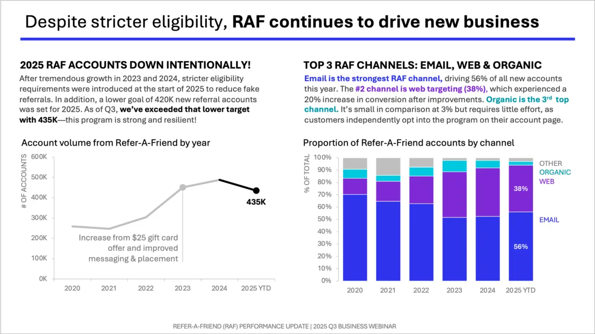
The physical layout of a presentation slide—where the primary graph lives, how much dedicated visual and spatial area the accompanying text receives, and how the human eye naturally moves through the visual landscape—is far more than a mere aesthetic choice. At its core, slide layout is a fundamental communication choice. When a presenter gets this spatial arrangement right, the audience effortlessly follows the underlying logic of the argument. Conversely, when the layout is poorly planned or cluttered, even exceptionally well-designed graphs can leave viewers feeling confused, distracted, and disconnected from the core message.
One of the most useful conceptual frameworks for addressing this challenge is known as vertical logic. This guiding principle dictates that all information presented on any given slide should be entirely self-reinforcing. Under this framework, the content must actively reinforce the main slide title, and the title must clearly frame the content. Simultaneously, the written words must reinforce the visual elements, and the visual graphics must support and amplify the written narrative. There should be nothing extraneous on the slide, and nothing entirely unrelated to the core theme. Instead, the layout should create a clear, seamless flow where a reader’s understanding deepens naturally with every single element they encounter. This concept, alongside its companion principle known as horizontal logic, is explored extensively in professional literature, including the foundational text storytelling with data.
Expanding upon these foundational principles, industry experts continue to refine how presenters can translate theoretical concepts into practical, everyday business applications. In the publication storytelling with data: before & after, expert contributors introduce specific, go-to layouts designed specifically to bring vertical logic into everyday corporate practice. These practical structures aim to bridge the gap between abstract design theory and the fast-paced demands of modern business communication.
Among these practical frameworks is the one-sided layout, a strategic design approach that gives a single, powerful graph a large, prominent position on the slide. In this configuration, carefully planned space for text is allocated across the top of the slide and down the right-hand side. This deliberate arrangement heavily leverages what cognitive psychologists refer to as the picture superiority effect. This well-documented psychological phenomenon demonstrates that human beings notice images significantly faster, understand them much more easily, and retain them in their memory much longer than they do words presented entirely on their own.
By utilizing a one-sided layout, a communicator is able to lead directly with the visual element, allowing the chart or graph to do the heavy lifting of conveying complex quantitative information. The surrounding text is then deployed strategically to frame, contextualize, and reinforce the primary message being driven home. In practical case studies featured in professional design literature, this specific structure is frequently employed to communicate succinct, high-impact marketing recommendations that require immediate clarity and swift audience alignment.