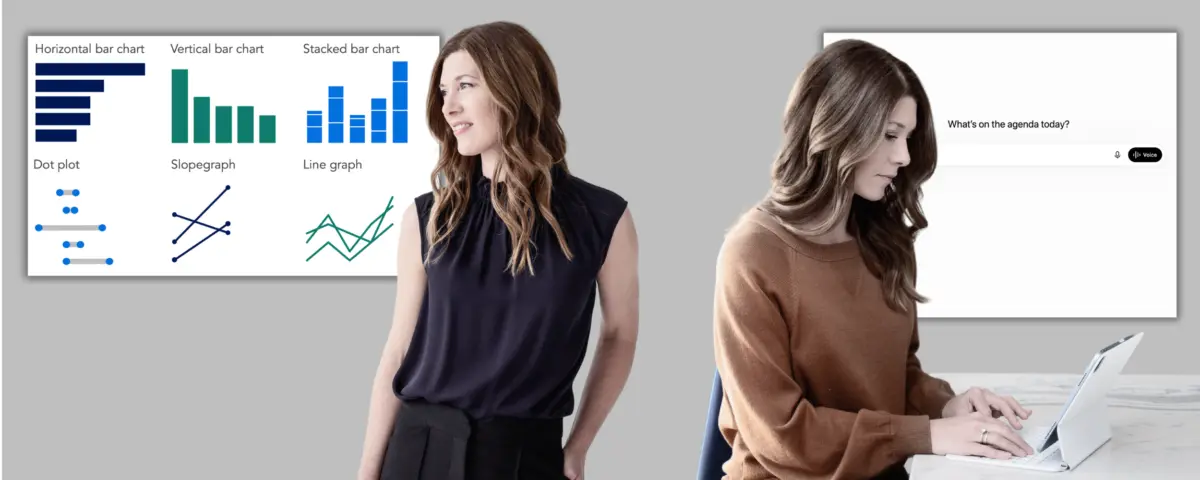
Selecting the right visual for a dataset is rarely a direct path from an initial concept to a finished chart. Professionals frequently test one format only to realize it emphasizes the wrong metric, requiring them to try another approach to get closer to their intended message. This iterative cycle—experimenting with multiple visual representations of the same underlying data to determine which one best serves a core narrative—represents a significant opportunity for artificial intelligence to accelerate workplace reporting and presentations.
While automated outputs can initially appear rough and require minor back-and-forth communication to refine, they allow analysts to quickly prototype various options. By evaluating these iterations against a specific takeaway message, professionals can commit to a solid visual direction before investing valuable time into building a final design.
Different chart types serve distinct analytical purposes. Bar charts are typically employed to compare data across discrete categories. Dot plots and slopegraphs emphasize measurable change between two distinct points in time or states. Line graphs effectively illustrate continuous change over long horizons. When uncertainty arises, sticking to familiar formats is often the wisest strategy, ensuring that audiences do not have to decipher an unfamiliar layout before grasping the underlying message. Designers are generally advised to employ less familiar visualizations only when those formats reveal unique insights that would otherwise remain obscured.
Working with AI: Choosing an Appropriate Visual
For analysts following structured storytelling workflows, the core takeaways are usually established during preliminary outline stages. For those approaching the task independently or operating in an exploratory mode, artificial intelligence can assist in identifying which metrics are worth visualizing first. By sharing a dataset and prompting the system to surface prominent patterns or trends, analysts can pinpoint interesting anomalies. Once an intriguing trend emerges, pausing to clearly articulate the takeaway message is vital before transitioning into prototyping. That articulation step ultimately transforms a raw prototype into a purposeful, audience-ready visual.
The subsequent workflow remains straightforward: users inform the system of what they wish to communicate, share the raw dataset, and request alternative visual options. There is no strict requirement to clean or aggregate the data prior to this step, as handling messy inputs is part of the capability set of modern language models. For each generated prototype, users can ask the system to explain the operational tradeoffs, detailing what each layout makes easily visible and what details it tends to obscure. The goal is not to delegate final decisions to an algorithm, but rather to use computational tools to quickly surface diverse options that can be evaluated using human judgment, audience awareness, and strategic goals.
Once a clear visual direction is selected, the chart can be built using traditional software or through AI-assisted features integrated directly into modern reporting tools. Regardless of the production method, the human creator remains fully responsible for the factual accuracy of the final display. However, rendering capabilities across various platforms and account tiers currently vary significantly.
Tool Performance and Potential Pitfalls
While planning and conceptual thinking can be aided by virtually any conversational platform, visual prototyping requires tools capable of rendering actual chart images. During testing, platforms such as Microsoft Copilot and free versions of ChatGPT frequently struggled to render distinct chart images for visual comparison, often defaulting to text-based approximations using symbols and code-like structures. In contrast, the free iterations of Google Gemini and Anthropic Claude generally produced much stronger visual outputs.
Paid subscription tiers consistently yield the highest quality results across the board, making them a worthwhile investment for professionals focusing heavily on data presentation. For those relying on free options, Gemini currently serves as a reliable alternative. Analysts seeking maximum flexibility can also copy and paste identical prompts across multiple platforms to generate a diverse pool of visual approaches for comparison and iteration.
Practical Application in People Analytics
To understand how this process functions in a real-world setting, consider the scenario of a people analytics manager operating within a mid-sized corporate consulting firm. Following a comprehensive internal study regarding a hybrid work policy—which evaluated employee performance ratings, physical office attendance logs, collaboration network metrics, and voluntary attrition trends—the analytics team formulated a concrete recommendation. Rather than maintaining a rigid policy that mandates three days in the office and two days remotely for every employee, the firm should transition to a flexible, differentiated framework tailored to specific role types and team structures.
Having established the foundational context and narrative arc through initial storyboarding phases, the next challenge involves creating the actual visual assets required for executive presentations. For a critical slide demonstrating how early-tenure employee attrition has risen since the hybrid policy was first introduced, Google Gemini can be deployed to assist with visual prototyping. For a subsequent slide illustrating how the uniform policy impacts distinct employee demographics in opposite ways, a different environment, such as ChatGPT Plus, can be utilized.
When prompting the AI for the attrition analysis, the manager specifies the audience as a leadership team holding divided opinions and significant stakes in the outcome. The primary takeaway centers on the sharp spike in early-tenure departures following the implementation of the hybrid mandate. The intended format is a single focal graph embedded within a live presentation designed to persuade executives to adopt a differentiated policy.
Before generating specific layouts, the AI may ask clarifying questions regarding the proposed policy details, potential sources of executive pushback, and whether leadership prefers traditional visual formats over unconventional designs. Once oriented, the system typically provides multiple layout options, such as a slopegraph, a grouped bar chart, or a dumbbell plot. In successful implementations, design choices—such as utilizing neutral gray tones to represent baseline pre-policy figures and mid-career tenure segments with stable metrics, while reserving high-visibility red exclusively for post-policy early-tenure attrition spikes—help direct the audience’s attention precisely where the narrative demands it.