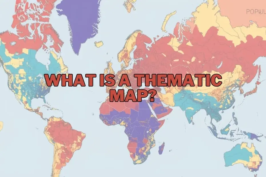
In an era dominated by big data, the ability to translate complex information into intuitive visual formats has become a cornerstone of effective communication, policy-making, and scientific research. While traditional maps have long served as essential tools for navigation, modern geography relies heavily on specialized visual mediums to uncover patterns, tell compelling stories, and make sense of complex socioeconomic and environmental phenomena.
Among these visual mediums, thematic maps stand out as an invaluable resource. Unlike standard road maps or topographic charts, thematic maps are designed to illustrate specific data patterns across geographic spaces. Understanding the design, application, advantages, and limitations of thematic mapping reveals why this practice remains crucial for researchers, urban planners, and decision-makers worldwide.
Defining the Thematic Map: Focus on Spatial Patterns
A thematic map is a specialized map designed to visualize specific data themes or patterns associated with a particular geographic area. While a general reference map focuses on representing physical and human-made features—such as roads, coastlines, political boundaries, and cities—a thematic map emphasizes a single subject or theme. This theme can range from population density and average annual rainfall to economic productivity, disease prevalence, or voting patterns.
The primary objective of a thematic map is to show the spatial distribution of a chosen variable. By utilizing colors, symbols, shading, and structural distortions, these maps transform raw statistical data into a spatial narrative. This allows geographers, researchers, and policymakers to easily identify spatial trends, anomalies, and correlations that would otherwise remain hidden within spreadsheets and database tables. For example, while a spreadsheet of regional unemployment rates requires tedious analysis to comprehend, a well-designed thematic map can instantly highlight localized economic distress through intuitive color gradients.
The Purpose and Strategic Importance of Thematic Mapping
Thematic maps serve a clear, pragmatic purpose: they simplify complex spatial data to facilitate better understanding and decision-making. By mapping statistical data onto geographic boundaries, these tools allow analysts to explore the relationships between location and human or natural activity.
The strategic importance of these maps spans several critical dimensions:
- Simplifying Complex Datasets: Large-scale datasets, such as national census records or global climate models, can be overwhelming. Thematic maps synthesize thousands of data points into a single, comprehensive visual representation.
- Revealing Spatial Relationships: These maps expose how different phenomena interact across space. For instance, mapping public health outcomes alongside industrial pollution sources can reveal critical environmental justice issues and guide regulatory interventions.
- Aiding Policy and Planning: Government agencies and urban planners rely on thematic maps to allocate resources effectively. By visualizing population growth, infrastructure capacity, or school district demographics, officials can make data-driven decisions regarding public investments.
- Enhancing Public Communication: Complex scientific or economic concepts, such as the spread of an infectious disease or the localized impacts of climate change, are more easily understood by the general public when presented through clear, spatial visualizations.
A Taxonomy of Spatial Visualization: Core Types of Thematic Maps
To represent different types of data accurately, geographers have developed various thematic mapping techniques. Choosing the appropriate map type depends on the nature of the data—whether it is continuous, discrete, qualitative, or quantitative—and the specific story the mapmaker intends to tell.
1. Choropleth Maps
Choropleth maps are among the most common and widely recognized thematic maps. They use progressive color shading, patterns, or symbols within predefined administrative boundaries (such as countries, states, counties, or census tracts) to represent the average value of a variable in those areas. For example, a choropleth map might display population density by shading highly populated states in dark blue and sparsely populated states in light blue.
While highly effective for showing regional trends, choropleth maps can sometimes mislead viewers by implying that a variable is uniformly distributed across an entire administrative zone, masking local variations within those boundaries.
2. Isoline and Isarithmic Maps
Isoline maps utilize continuous lines to connect points of equal value, making them ideal for visualizing continuous phenomena that transition smoothly across space without abrupt administrative boundaries.
Common examples include topographic maps (where contour lines represent equal elevation), isobar maps (representing atmospheric pressure), and isotherm maps (representing temperature). These maps are crucial in meteorology, oceanography, and geology, where natural phenomena do not conform to political borders.
3. Proportional and Graduated Symbol Maps
Proportional symbol maps scale the size of a chosen symbol—most commonly a circle—in direct proportion to the data value at a specific location. Unlike choropleth maps, which tie data to entire geographic areas, proportional symbol maps associate data with precise point locations or regional centers.
For instance, a map illustrating the volume of cargo handled by major global ports would place larger circles over high-capacity ports and smaller circles over regional harbors. This approach allows viewers to compare absolute quantities across different locations without being influenced by the physical size of the surrounding geographic region.
4. Dot Density Maps
Dot density maps use identical dots to represent a specified quantity of a given phenomenon. Each dot corresponds to a set value—for example, one dot representing 500 agricultural acres or 1,000 residents. The spatial concentration of the dots reveals areas of high density and clustering, while sparse dot distributions indicate low concentration.
This technique is highly effective for showing the raw distribution and spatial pattern of a population or resource without the artificial boundaries imposed by shaded choropleth zones.
5. Cartograms
Cartograms are unique thematic maps that intentionally distort geographic size or distance to represent a specific variable. In a value-by-area cartogram, the physical size of a country or state is scaled in proportion to the data value being mapped, such as gross domestic product (GDP) or total population.
As a result, a country with a massive population but a small landmass, like Bangladesh, would appear significantly larger on a population cartogram than a country with a vast landmass but a small population, like Canada. Cartograms are highly engaging visual tools that challenge conventional spatial perceptions to emphasize statistical disparities.
Anatomy of an Effective Thematic Map: Key Design Elements
Creating a map that is both visually appealing and scientifically accurate requires careful attention to cartographic design principles. A professional thematic map relies on several key elements to ensure its data is interpreted correctly:
- Clear The title must explicitly define the theme of the map, the geographic region covered, and the time period of the data represented.
- Comprehensive Legend: The legend is the key to decoding the map. It must clearly define what each color, shade, line, or symbol represents, including the classification ranges used for quantitative data.
- Scale and Projection: Although thematic maps prioritize data patterns over exact navigation, a scale bar is necessary to provide spatial context. Furthermore, choosing the correct map projection is vital; for instance, equal-area projections are crucial for choropleth maps to ensure that geographic areas are not distorted in a way that misrepresents the data density.
- Data Source Attribution: Credibility is paramount in journalistic and scientific reporting. Every thematic map should clearly cite the origin of its underlying dataset, allowing viewers to verify the reliability of the information.
- Orientation and Contextual Labels: A north arrow or graticule helps orient the reader, while selective labels for major landmarks, cities, or political boundaries provide necessary geographic context without cluttering the thematic data.
Real-World Applications Across Industries
The utility of thematic mapping extends far beyond academic geography. Diverse professional sectors rely on these visualizations to solve complex spatial problems and optimize operations.
Public Health and Epidemiology
Modern epidemiology relies heavily on thematic mapping to track the origin, spread, and containment of diseases. By mapping active infection cases alongside demographic data, health officials can identify vulnerable populations, allocate vaccines, and implement targeted quarantine measures. This practice traces its roots back to Dr. John Snow’s famous 1854 dot map of London, which linked cholera cases to a specific public water pump, revolutionizing public health.
Environmental Conservation and Climate Science
Thematic maps are indispensable for monitoring environmental degradation, habitat loss, and climate change. Scientists use them to visualize global temperature anomalies, track deforestation rates in the Amazon, map the vulnerability of coastal areas to rising sea levels, and identify critical migration corridors for endangered wildlife. These visual tools help transform abstract climate models into tangible regional impacts that can motivate policy action.
Urban Planning and Demographics
Municipal governments and urban planners use thematic maps to design sustainable, efficient cities. By mapping population growth patterns, public transit usage, housing affordability, and green space distribution, planners can identify underserved neighborhoods and direct infrastructure investments to where they are needed most.
Business Intelligence and Market Analysis
In the corporate sector, thematic mapping is a core component of location intelligence. Retailers, real estate developers, and insurance firms use these maps to analyze customer demographics, evaluate competitor locations, assess regional risk profiles, and determine the optimal sites for new facilities or marketing campaigns.
Weighing the Benefits: Key Advantages of Thematic Maps
The widespread adoption of thematic maps across scientific and commercial disciplines is driven by several distinct advantages:
- Cognitive Efficiency: Humans are inherently visual learners. A thematic map can communicate spatial patterns, clusters, and anomalies within seconds—insights that would take hours to extract from raw, non-spatial databases.
- Contextual Integration: By overlaying statistical data onto physical geography, thematic maps allow analysts to see how human activities are shaped by geographic barriers, natural resources, and political boundaries.
- Versatility: These maps can represent almost any variable that can be tied to a location, making them applicable to fields as diverse as sociology, economics, geology, and retail logistics.
Navigating the Limitations and Ethical Considerations
Despite their significant advantages, thematic maps are not neutral representations of reality; they are generalizations that carry inherent limitations and risks of misinterpretation.
- Data Generalization and Modifiable Areal Unit Problem (MAUP): Aggregating individual data points into arbitrary administrative units (such as ZIP codes or counties) can obscure localized variations. This can lead to ecological fallacies, where assumptions about individuals are made based on aggregate regional data.
- Classification and Visualization Bias: The way a mapmaker divides continuous data into classes (such as choosing between equal interval, quantile, or natural breaks classification) can drastically alter the appearance of a map. A mapmaker can manipulate these intervals to make a trend look either alarming or negligible, highlighting the need for cartographic integrity and transparency.
- Visual Distortions: On standard choropleth maps, larger geographic areas naturally dominate the viewer’s attention, regardless of their statistical significance. For example, on a political map, large, sparsely populated rural districts can visually overpower small, densely populated urban centers, potentially skewing the viewer’s perception of overall patterns.
The Modern Toolkit: Software and Technology in Cartography
The process of creating thematic maps has transitioned from hand-drawn cartography to highly sophisticated digital workflows. Today, cartographers, journalists, and data scientists have access to a robust ecosystem of specialized software:
- Professional Geographic Information Systems (GIS): Industry-standard software packages like Esri’s ArcGIS Pro and the open-source alternative QGIS offer unparalleled analytical power. These platforms allow users to perform advanced spatial analysis, manage massive geodatabases, and design highly customized, publication-grade thematic maps.
- Business Intelligence and Data Visualization Platforms: Tools like Tableau and Microsoft Power BI have integrated robust mapping capabilities, allowing business analysts without formal GIS training to quickly generate interactive choropleth and proportional symbol maps directly from corporate databases.
- Web-Based Cartography and Programming Libraries: For interactive online reporting, developers utilize web-mapping platforms like Mapbox, Carto, and Leaflet. Additionally, data scientists increasingly rely on programming languages like Python (using libraries such as GeoPandas, Matplotlib, and Folium) and R (using ggplot2 and sf) to automate the generation of data-driven maps.
As spatial datasets continue to grow in volume and complexity, these modern tools ensure that thematic mapping remains an agile, precise, and powerful medium for translating raw global data into actionable geographic insights.
Frequently Asked Questions
What is the primary difference between a thematic map and a reference map?
A reference map is designed to show the locations of geographic features, such as roads, rivers, cities, and political boundaries, primarily for navigation and spatial orientation. In contrast, a thematic map focuses on a specific subject or data theme, using geography as a canvas to illustrate the spatial distribution and patterns of variables like population density, climate data, or economic activity.
Can thematic maps be used to visualize historical trends?
Yes. Thematic maps are excellent tools for visualizing temporal changes across geographic spaces. By comparing a series of thematic maps from different time periods—or by utilizing interactive, animated digital maps—researchers can track phenomena such as urban expansion, migration patterns, environmental degradation, or economic shifts over time.
Which software options are best suited for beginners who want to create thematic maps?
For beginners, user-friendly business intelligence platforms like Tableau or web-based cartography tools like Carto offer intuitive drag-and-drop interfaces for creating basic thematic maps. For those interested in learning professional geographic information systems, QGIS is a highly recommended, free, open-source platform with an extensive global community and numerous learning resources.
How do mapmakers choose the correct type of thematic map for their data?
The choice depends entirely on the nature of the dataset. Continuous, smooth datasets that flow across space without abrupt boundaries (such as temperature or elevation) are best represented using isoline maps. Categorical data or data aggregated into administrative units (such as average income by state) is ideal for choropleth maps. When mapping absolute values at specific points, proportional symbol maps are preferred, while dot density maps are best for showing raw distribution and concentration.