In the fast-evolving landscape of data communication, choosing the right visual is rarely a straight line from a first attempt to a finished graph. Analysts often try one form, realize it emphasizes the wrong message, and shift to another, repeating the trial-and-error cycle until they get closer to their goal. This iterative process of experimenting with different views of the same data to find the one that best serves a specific narrative is now experiencing a significant shift, as professionals increasingly turn to artificial intelligence to accelerate the prototyping phase.
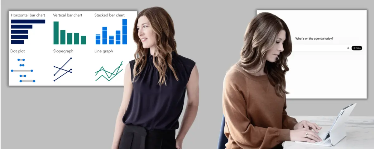
Industry experts note that traditional graph selection relies heavily on matching the data structure to a familiar visual format. Bar charts compare across categories, while dot plots and slopegraphs emphasize change between two distinct points. Line graphs remain the standard for showing change over time. When in doubt, visualization practitioners often advise sticking to familiar formats so that audiences do not have to learn how to read a graph before they can understand the underlying message. Unfamiliar visuals are typically reserved for revealing insights that would otherwise remain hidden.
However, translating raw figures into an effective visual representation often requires extensive back-and-forth. Rather than spending valuable hours building a chart only to realize late in the design process that it fails to support the core takeaway, professionals can now use AI to prototype multiple options quickly. This allows them to evaluate different views against their intended message and commit to a clear direction before investing time in building a final production asset.
Working with AI: Choosing an Appropriate Visual
When integrating AI into a visualization workflow, the process generally begins with a clear understanding of the core takeaway, often outlined during initial storyboarding phases. For those approaching the task independently or still operating in an exploratory mode, AI can assist in uncovering patterns and trends worth highlighting from a raw dataset. Once an interesting trend emerges, analysts pause to articulate the primary takeaway before moving into prototyping, ensuring the final visual remains purposeful rather than purely decorative.
The subsequent workflow involves explaining the communication goals to the AI, sharing the underlying data, and requesting a set of visual options. Analysts do not need to spend time cleaning or aggregating the data beforehand, as modern language models can manage much of the data preparation phase. For each generated prototype, users are encouraged to ask the AI to explain the trade-offs, detailing what each layout makes immediately visible and what details it might obscure. The objective is not to delegate the final decision to the algorithm, but rather to use AI as a thought partner to rapidly surface options for evaluation based on deep knowledge of the target audience and strategic goals.
Once a definitive direction is chosen, the chart can be constructed in a preferred design tool, either independently or with the assistance of built-in AI features. Regardless of how the final visual is produced, the responsibility for maintaining accuracy rests entirely with the human creator.
Evaluating Tool Capabilities and Pitfalls
As professionals experiment with these workflows, practitioners must remain mindful of potential technical hurdles. Chart-rendering capabilities currently vary significantly across different software platforms and account tiers. While any language model can assist with planning, conceptualization, and contextual thinking, visual prototyping requires tools capable of rendering actual chart images. Even with advanced platforms, users frequently find that it takes multiple prompts to generate visual graphics rather than text-based ASCII approximations of charts.
Recent testing indicates that free tiers of certain conversational AI systems struggle to render chart images for visual comparison, whereas alternative platforms consistently produce stronger graphic outputs. Paid subscription tiers generally deliver the highest quality results overall, making them a worthwhile investment for teams focused heavily on data presentation. If access is limited, analysts can maximize their options by copying and pasting identical prompts across multiple competing tools to generate a diverse set of visual approaches for comparison and iteration.
Practical Application in People Analytics
To understand how this approach functions in a real-world setting, consider the scenario of a People Analytics Manager at a mid-sized consulting firm. Following a comprehensive internal study examining the firm’s hybrid work policy—which evaluated performance ratings, in-office attendance patterns, collaboration network data, and attrition trends—the analytics team developed a firm recommendation: transition away from the current blanket policy of three days in office and two days remote for all employees, moving instead toward a differentiated approach tailored to specific roles and team types.
Working through the initial context and story-planning stages, the manager established the overarching narrative arc and developed specific takeaway titles for each planned slide. The next operational phase involved creating the actual content, which required selecting and building effective graphs to support different segments of the presentation.
For the first graph—designed to demonstrate how early-tenure attrition has increased noticeably since the implementation of the hybrid policy—the manager utilized Gemini, which offered strong performance among free-tier options. To initiate the process, the manager provided a standardized prompt establishing the audience as a leadership team with divided opinions and high stakes in the outcome. The stated goal was to show that early-tenure attrition had spiked under the hybrid policy, with the ultimate objective of persuading leadership to adopt a new, differentiated policy framework.
Along with this context, the manager supplied a summary data table detailing pre- and post-policy attrition rates broken down by role type and tenure. Before generating visual suggestions, the AI asked several clarifying questions to better understand the proposed differentiated policy, the anticipated sources of leadership pushback, and whether the audience preferred traditional visual formats or was open to less familiar chart types.
After reviewing the context and clarifying details, the system proposed three distinct visual options: a slopegraph, a grouped bar chart, and a dumbbell graph. The AI explained its design choices, noting that neutral gray tones were applied to represent the pre-policy baseline alongside mid- and senior-tenure segments where no dramatic shifts occurred, while a striking red was used to highlight early-tenure attrition post-policy where the most significant change took place. Through this iterative dialogue, the analytics manager was able to quickly evaluate multiple visualization paths and select the most effective format to drive the organization’s strategic decision-making forward.