In the modern landscape of data-driven decision-making, the ability to communicate information clearly and efficiently is a critical skill for professionals across all industries. Whether compiling quarterly financial results, tracking operational metrics, or presenting market research, analysts frequently rely on software tools like Excel, Microsoft Word, or PowerPoint to generate charts and graphs. While contemporary graphing tools and artificial intelligence assistants can produce visual representations of data in a matter of seconds—often applying automated color palettes and highlights along the way—they fundamentally lack context. These systems do not know which specific data points matter most to a given audience. That critical judgment call remains entirely in the hands of the communicator.

According to data communication experts, one of the most effective strategies for explanatory communications is the sparing and purposeful use of color. Rather than accepting the default rainbow of hues frequently generated by software applications, data professionals should treat color as an explicit choice. When used thoughtfully, a restrained palette serves as one of the fastest and most efficient ways to improve the comprehension of a graph, guiding the viewer’s eye directly to the core message without causing visual fatigue or distraction.
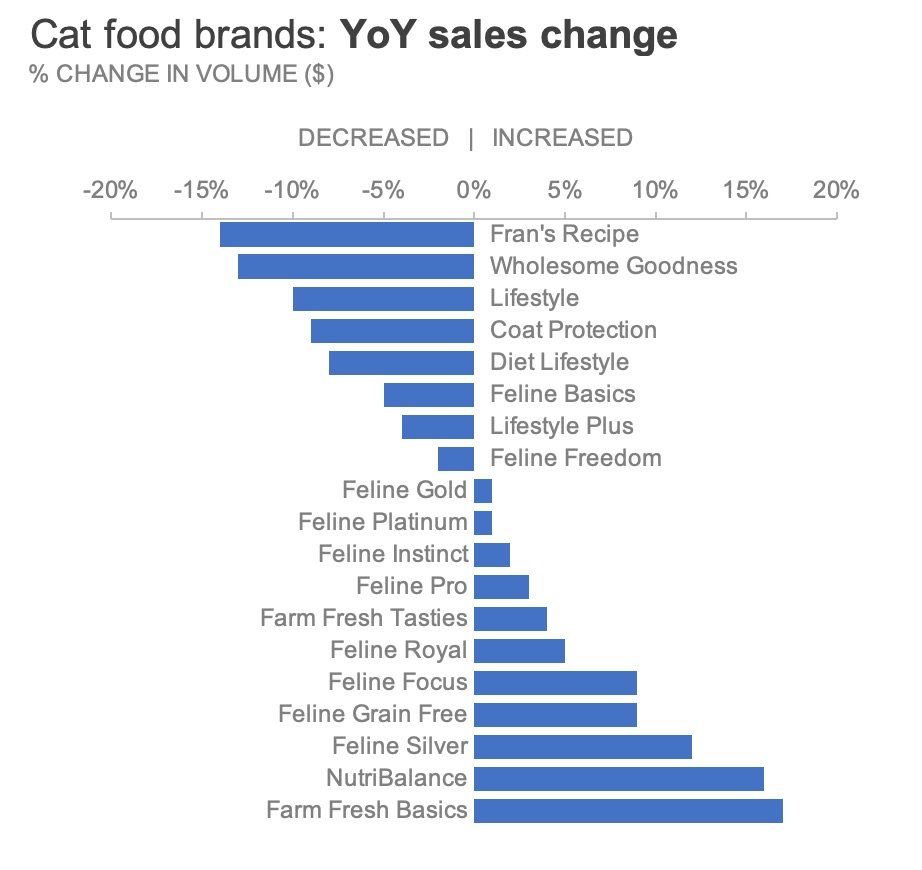
To explore how these principles can be applied practically, communication specialists often examine real-world scenarios, such as a dataset tracking year-over-year sales changes for various cat food brands manufactured by a pet products company. This particular case study, drawn from foundational data storytelling exercises, provides a clear lens through which to evaluate the impact of visual editing. By examining the raw, software-generated output of such a dataset, professionals can learn how to strip away unnecessary visual noise and rebuild the graphic to serve their narrative objectives.
Start in Greyscale
A reliable foundational approach to designing effective charts is to begin entirely in shades of grey, introducing color only in locations where the audience’s focus is specifically required. Constructing a neutral foundation using a greyscale palette provides a blank slate and acts as an intentional reminder that additional design work is necessary before a graphic is ready for professional presentation. This intermediate state makes it considerably easier to be deliberate about where color truly belongs, preventing the chaotic visual clutter that often plagues default software outputs.
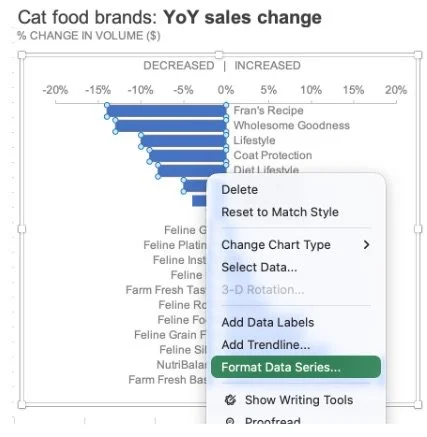
The process typically begins by removing the default color palette assigned by spreadsheet software and replacing it uniformly with a neutral shade of grey. By accessing the formatting options within the charting software, designers can adjust the fill and line settings of the data series. Applying a clean, uniform grey across all elements of a chart creates a balanced baseline. For professionals who frequently produce reports, establishing and saving this kind of neutral visual output as a reusable template can significantly streamline workflow, eliminating the need to repeatedly execute manual formatting steps for future projects.
Highlight What Matters
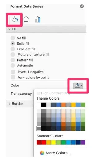
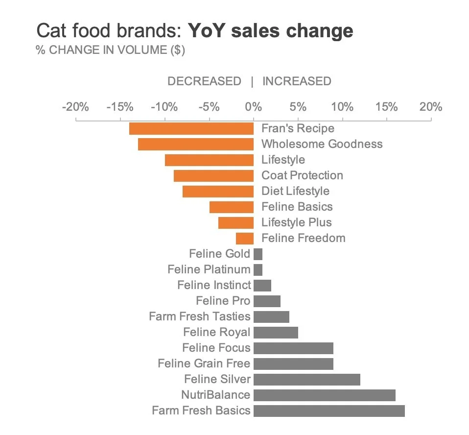
Once a neutral greyscale foundation has been established, the next strategic phase involves deliberately drawing attention to the most critical insights within the data. Consider a scenario where a manufacturer needs to call specific attention to the cat food brands that experienced a decline in sales over the previous year. To emphasize these problem areas, a designer might choose to apply color exclusively to the bars representing negative growth, leaving the remaining data points in neutral grey.
When selecting hues for highlighting negative trends, accessibility considerations play a vital role. Rather than relying on traditional bright red—which can present challenges for viewers with certain types of color vision deficiencies—designers often opt for an alternative hue such as orange, which naturally reinforces negative sentiment while maintaining higher accessibility standards. Applying this distinction requires targeting specific data points individually within the charting interface rather than altering an entire data series at once, ensuring that only the relevant bars carry the intended emphasis.
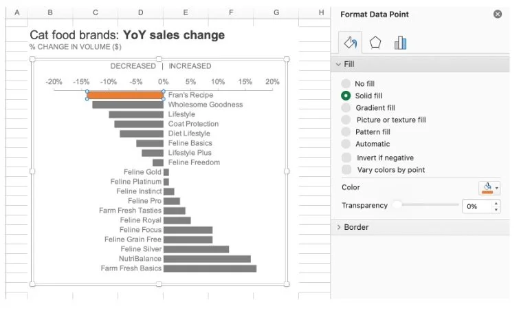
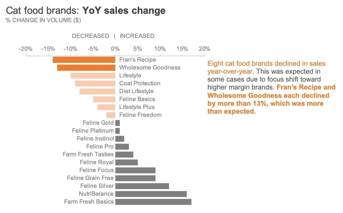
To further refine the visualization, communicators can employ techniques that vary color intensity. Imagine a situation where, among the group of declining brands, a presenter wants to draw exceptional focus toward the two products that suffered the most severe drops: Fran’s Recipe and Wholesome Goodness. Simply coloring all declining brands in a uniform shade of orange would fail to distinguish the severity of these specific drops. Instead, varying the intensity of the color allows the designer to highlight the broader category of negative growth while simultaneously spotlighting the most critical outliers.
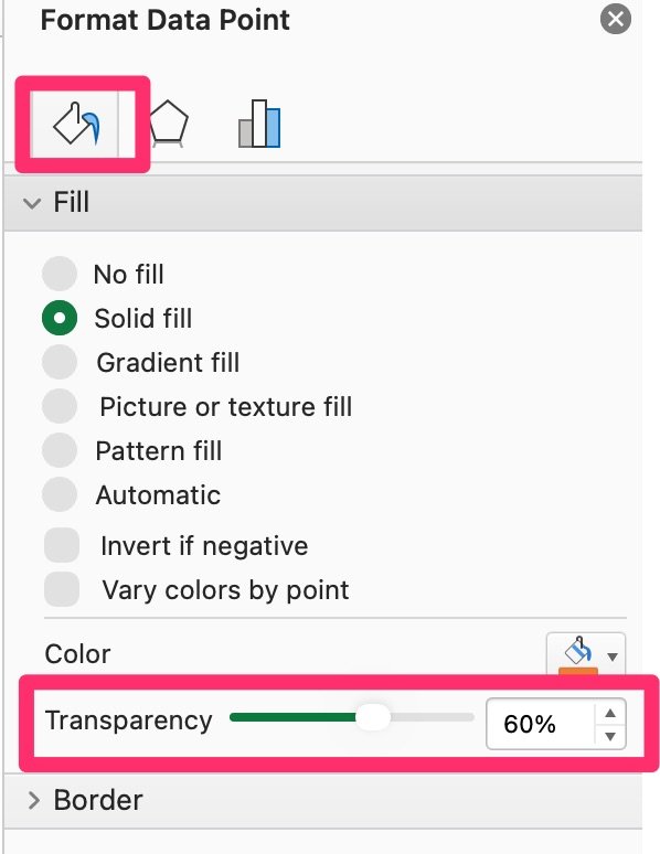
Achieving this visual hierarchy can be accomplished through several methods available within standard spreadsheet and presentation applications. One approach involves manually selecting individual data points and applying lighter or paler shades of orange to the less severe declines while reserving a saturated tone for the most dramatic drops. Alternatively, designers can maintain a single color hue and adjust transparency settings within the fill menu to create a graduated visual effect. Another common technique involves overlaying semi-transparent geometric shapes, such as rectangular objects formatted with white fills and adjusted opacity, directly over specific sections of the chart to subdue background data without entirely obscuring it. By thoughtfully manipulating intensity, creators ensure that the audience immediately registers both the overall trend and the most urgent anomalies.
Include Words for Clarity
While a well-designed chart can communicate significant information on its own, external context is often necessary when a visual must be consumed independently by an audience. If a presenter is not physically present to walk stakeholders through the information, pairing the designed chart with explanatory text enhances overall comprehension. Incorporating a concise text annotation directly next to the relevant data points bridges the gap between numbers and narrative.
To maximize the effectiveness of these annotations, designers can employ a technique where key words within the text are styled with the exact same color and typographic weight as the corresponding data elements in the chart. This visual tethering connects the written takeaway directly to the graphical evidence, allowing viewers to grasp the primary conclusion almost instantly. Ultimately, color should serve entirely to support the core message rather than distracting from the underlying data. By adhering to a restrained palette, purposeful highlighting, and clear textual integration, data communicators can successfully guide their audiences to the intended takeaways with precision and clarity.